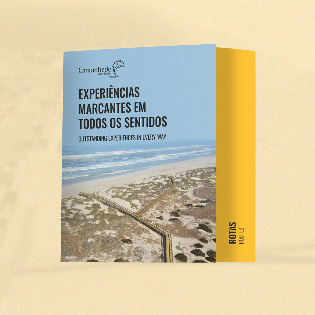
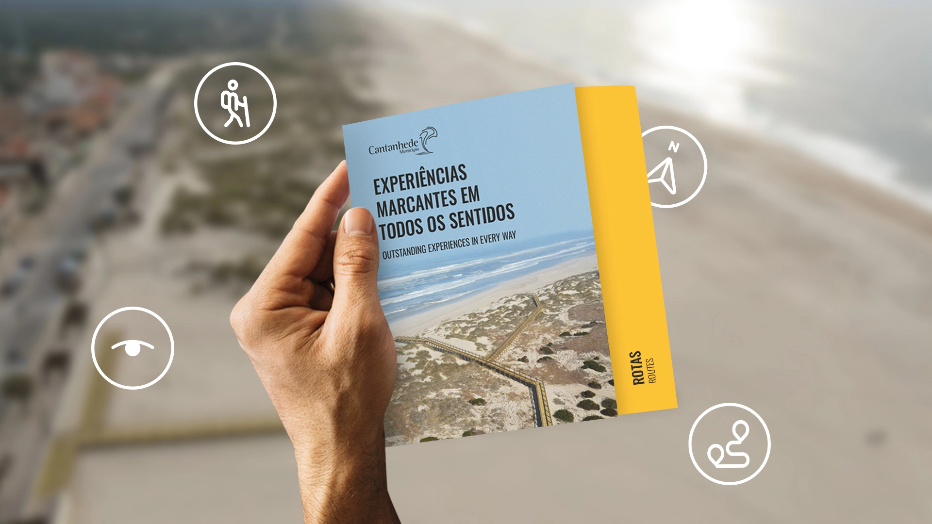
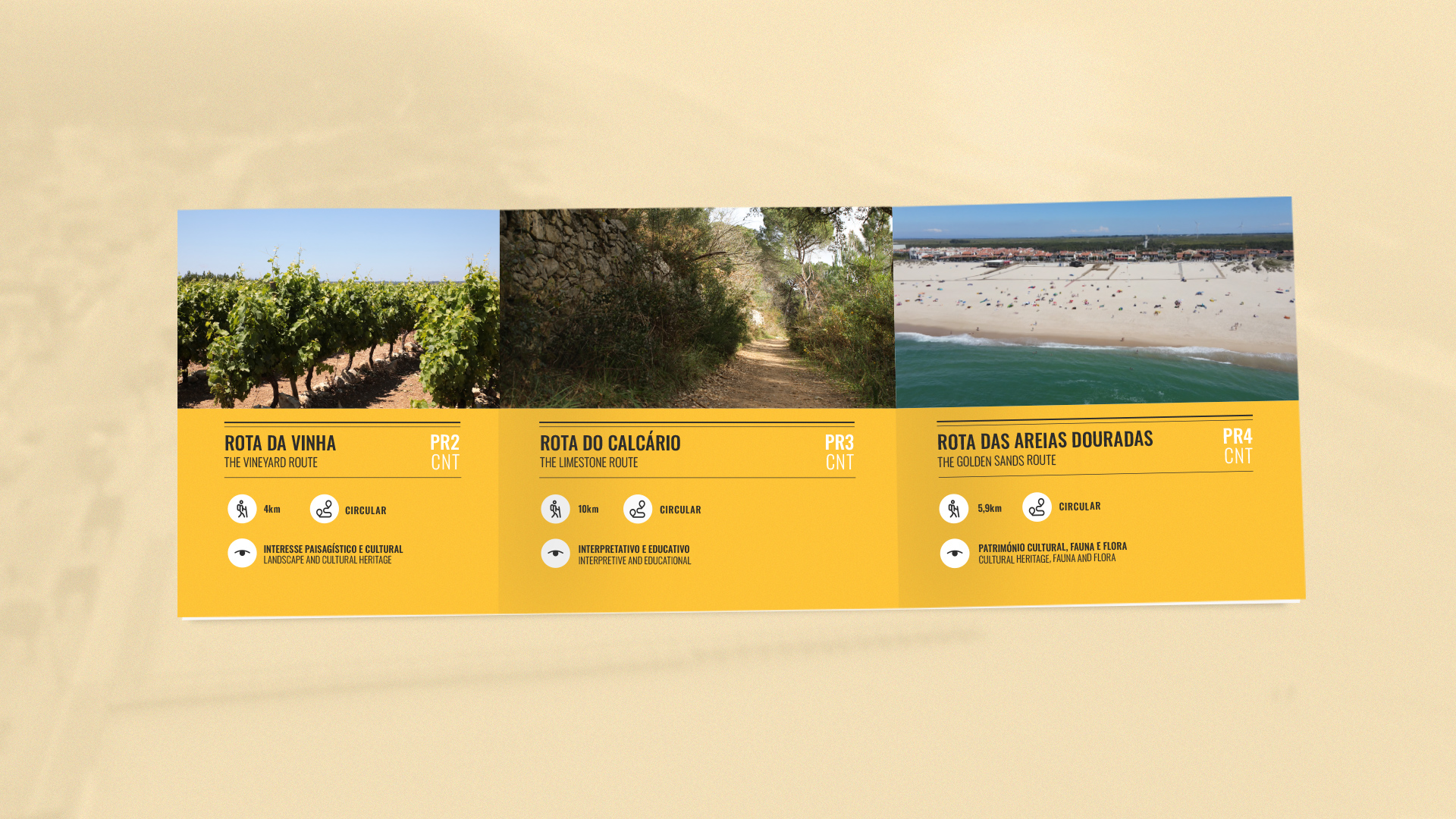
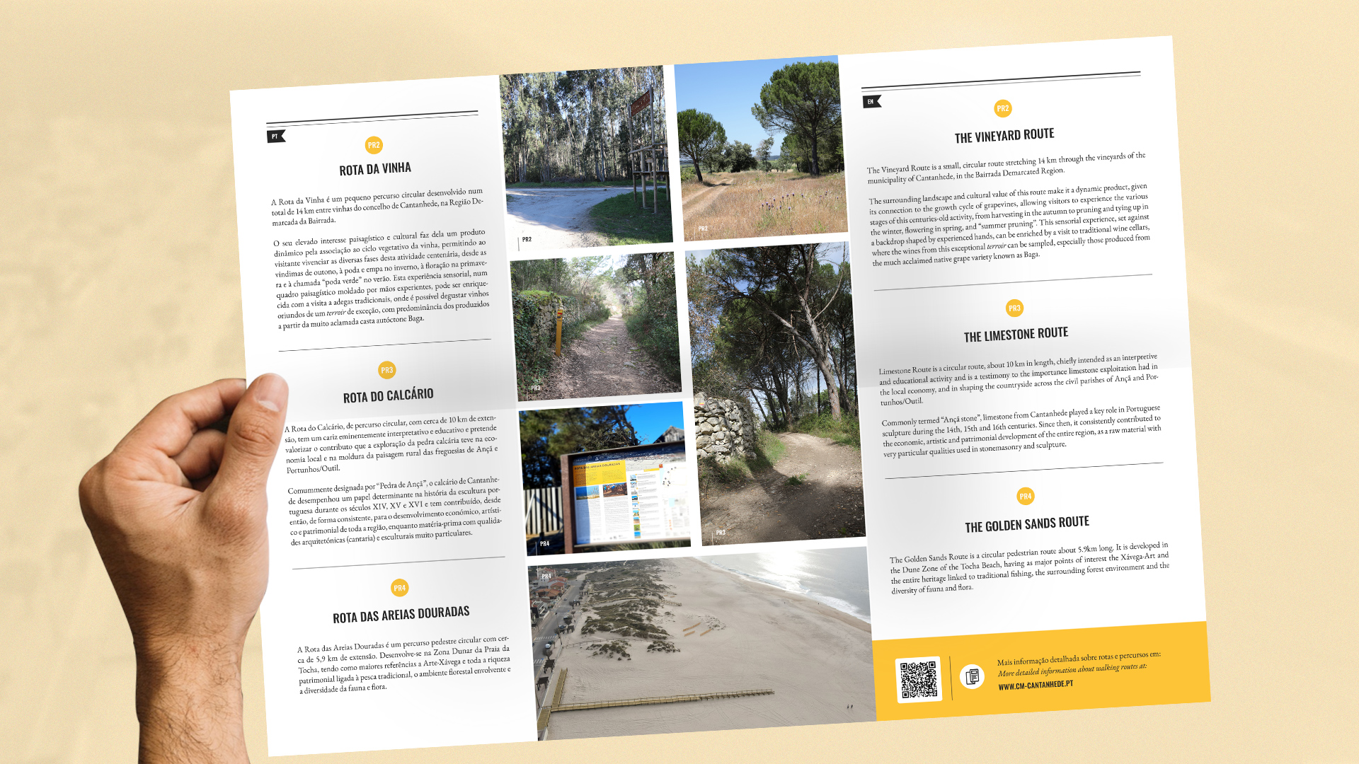
Tourist guides, which are easy to handle and store, are pieces of communication and guidance that enhance territories and regions. Find everything you need to start exploring Cantanhede's routes and discover the municipality.
The Port of Aveiro’s rebranding respected the essence of this centuries-old organization, which boasts a legacy of over 212 years of history. With the desire to mark a turning point and position the institution on an international level, the new identity evokes the quest for direction and purpose through elements such as the North Star, the astrolabe, and the lighthouse, here brought together to create a meeting point, the intersection between history and the future. This imagery reinforces the institution's foundations, based on cooperation, industry, and sustainability, while embracing the innovative and technological profile of a modern and differentiated port that desires to be closer to the community.
The evolution of Farmácia Nova da Maia brought with it a renewed experience of proximity, comfort, and modernity. The move to a larger, brighter, and more contemporary space highlighted the need to align the visual identity with this new reality. We developed a brand refresh that preserved its essence while redefining its visual presence. The intervention focused on creating a lighter, more human, and welcoming visual language through the refinement of the color palette, the balance of graphic elements, and the alignment of the identity with the real experience of the space.